
Resilience Community Counseling | Brand Identity
Community-based private practice group based in Pennsylvania. The goal was to create a brand that shows personal growth and self-fulfillment with a space where individuals can embark on their mental health journey and achieve new heights of growth and well-being.
Team Size: 2
Owner/Operator
Designer
Duration:
36hrs
Skills developed:
Sketching
Color study
Responsibilities:
Prototyping
Researching what is currently out there for brands in these fields
Visual design
Tools Used:
Paper Sketching
Illustrator
Photoshop (for final mockups)

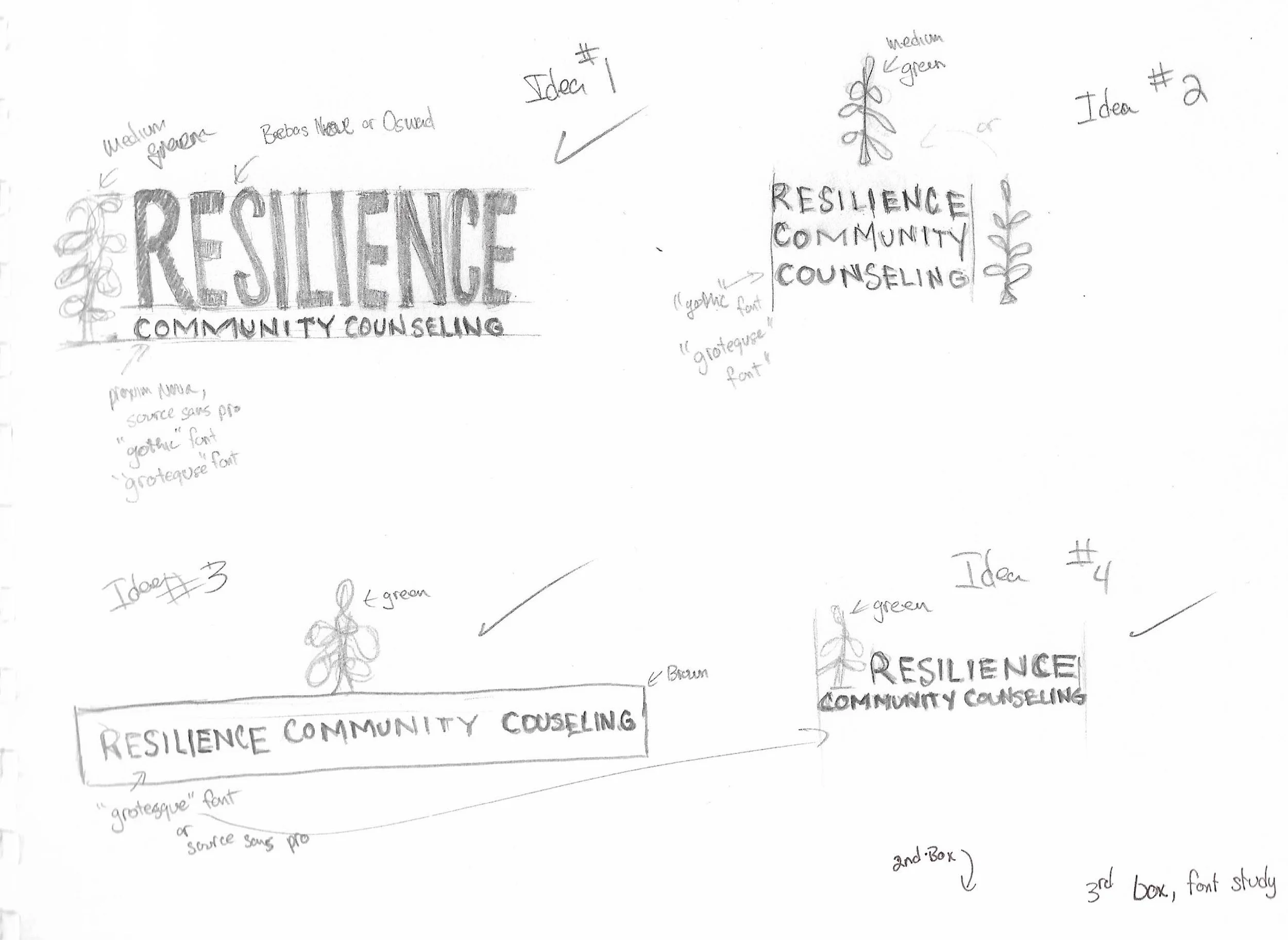
The brand is focused on mental health and wellness, so a leafy green plant was asked to be added to symbolize growth, renewal, and natural vitality. I considered how to combine these elements—plant, color, texture, and typography—to create a unique visual identity that captures the essence of the brand. I came up with four layouts per our discussions and the first and third layout option was chosen.
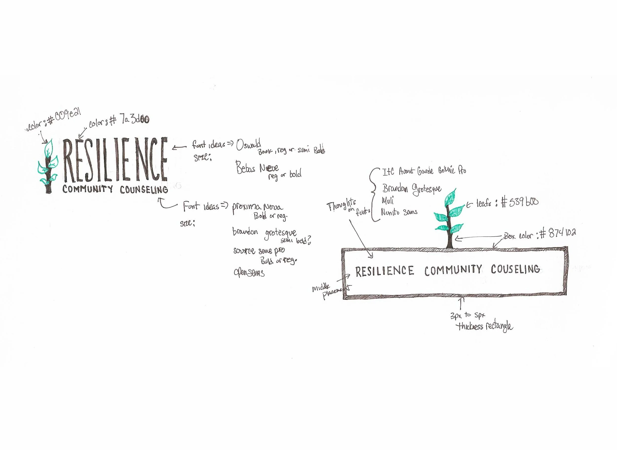
After several iterations, we narrowed down our options to two distinct layouts. The first layout featured a minimalistic approach, with a focus on white space and typography. The second layout was a grid-based design. I presented these two options to the client and discussed the pros and cons of each design. After careful consideration and a few modifications, the client ultimately decided that she wanted to see both in different fonts families to help with a final decision


With the two final layouts chosen, It was time for font study. She has told me that she was wanting the font to be clean and modern like some of the examples that were shown to me earlier. Starting from the top left, The pairing used was Oswald light & Proxima Nova semibold. The next one down is the pair of Bebas Neue book & Open Sans semi-bold. Then the last one of that group is Korolev Compressed medium & Futura PT heavy.
The group to the right starts off with Brandon Grotesque bold. the next one down is Muli (now Mulish) in semi-bold. The last one is semi-bold Nunito Sans.


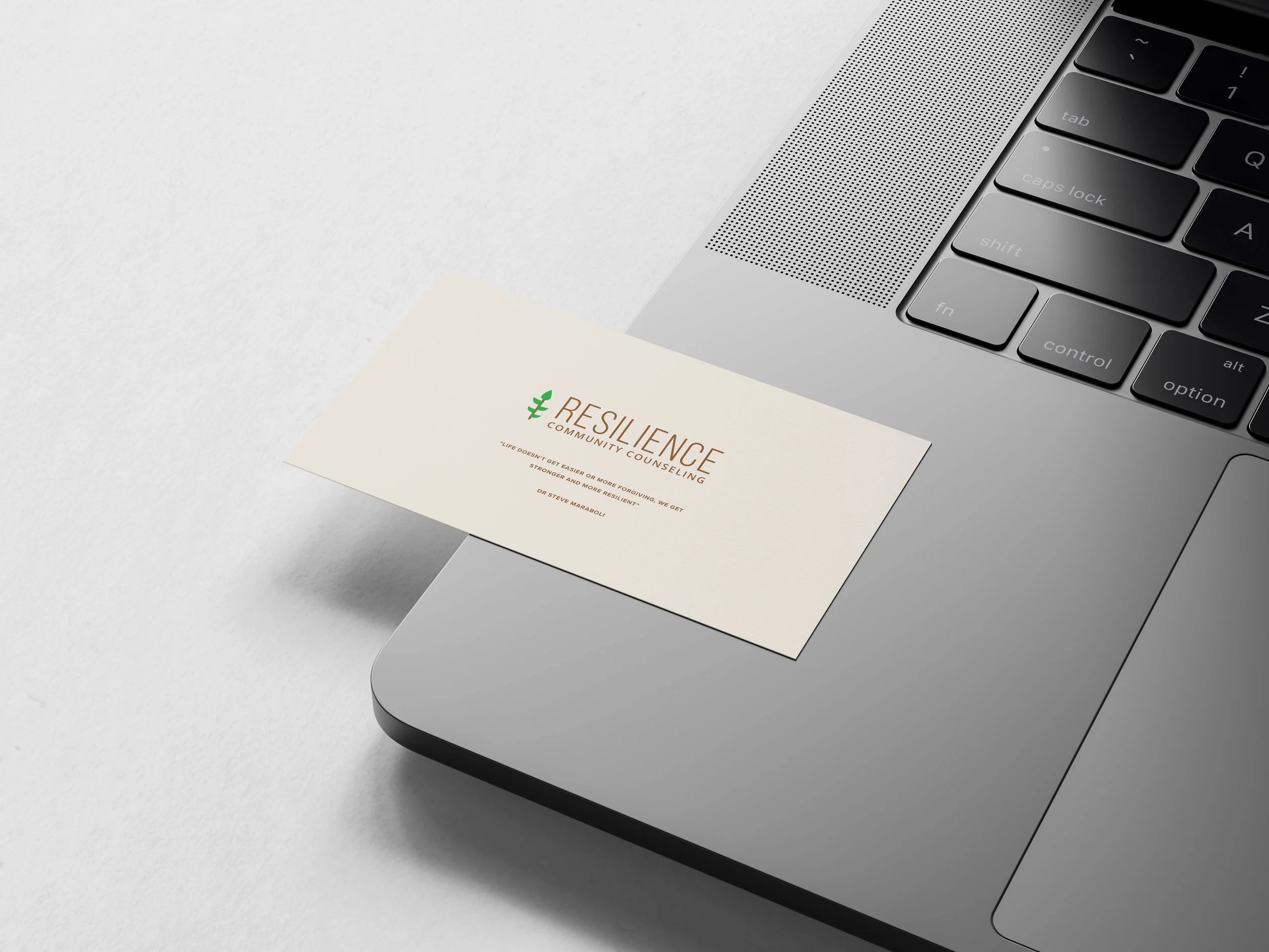
The middle right font pairing was chosen. So, before sending the final design, I wanted to show how it would look in black & white (general rule of thumb of course) when those two options were needed.
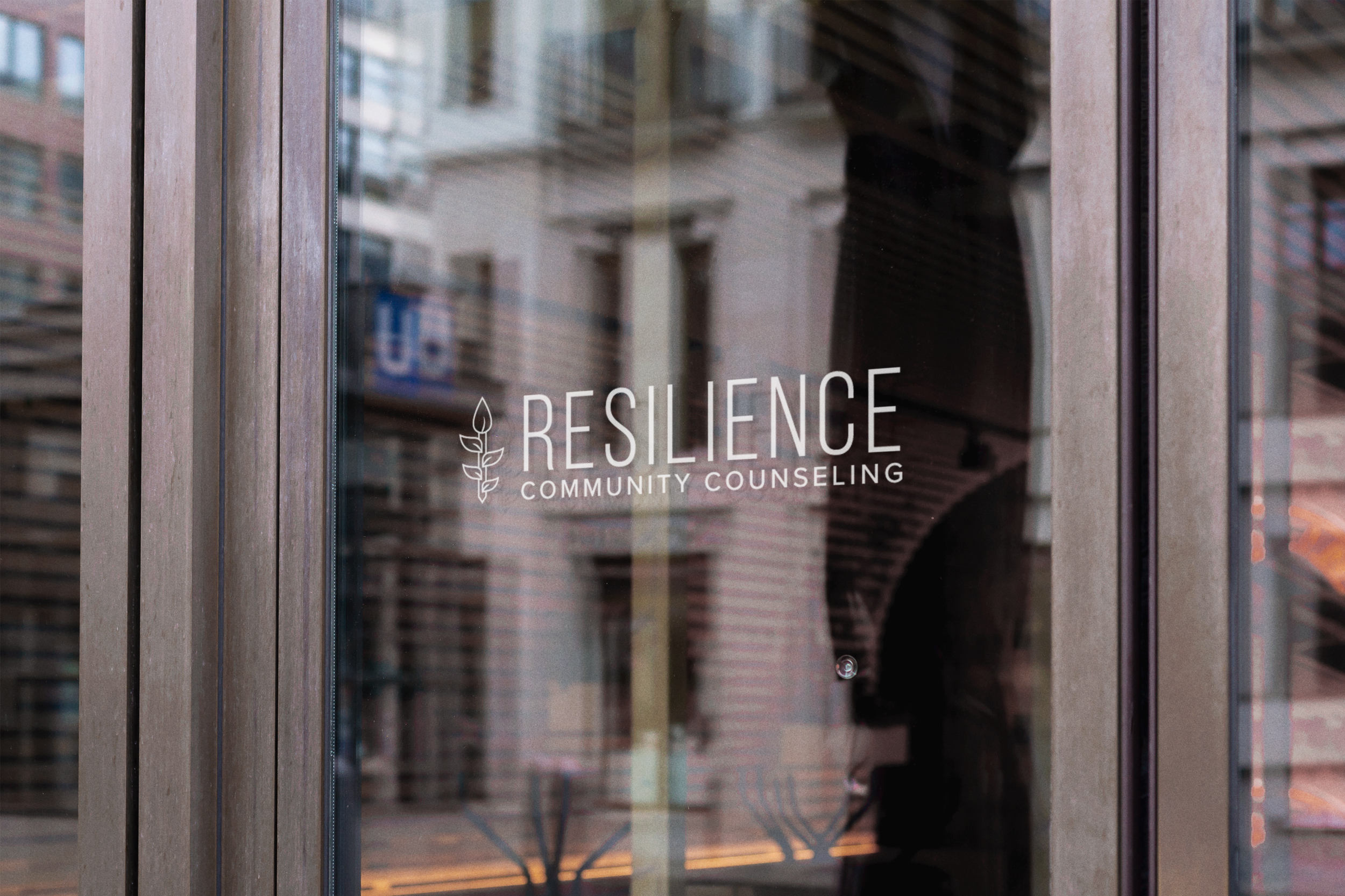
As you can see from the above mockup, the new logo incorporates modern and clean design principles, with an emphasis on typography and color selection. This final logo truly encapsulates the essence of Resilience Community Counseling.